Cha Cha Matcha Rebranding
Keeping the essence of the current brand ideas, upgrade it to a cleaner, cultural originated, and fun design.
Brand
Cha Cha Matcha is a matcha-based cafe located in New York and California. The brand highlights how matcha brings energy and is a healthy drink to have.
Problem
The current design is really confusing, with elements like vibrant color gradients, palm trees, hot pink, which has nothing to do with matcha. Furthermore, the current color palette can be biased towards female audiences, which leads to less male customers consuming.
Idea
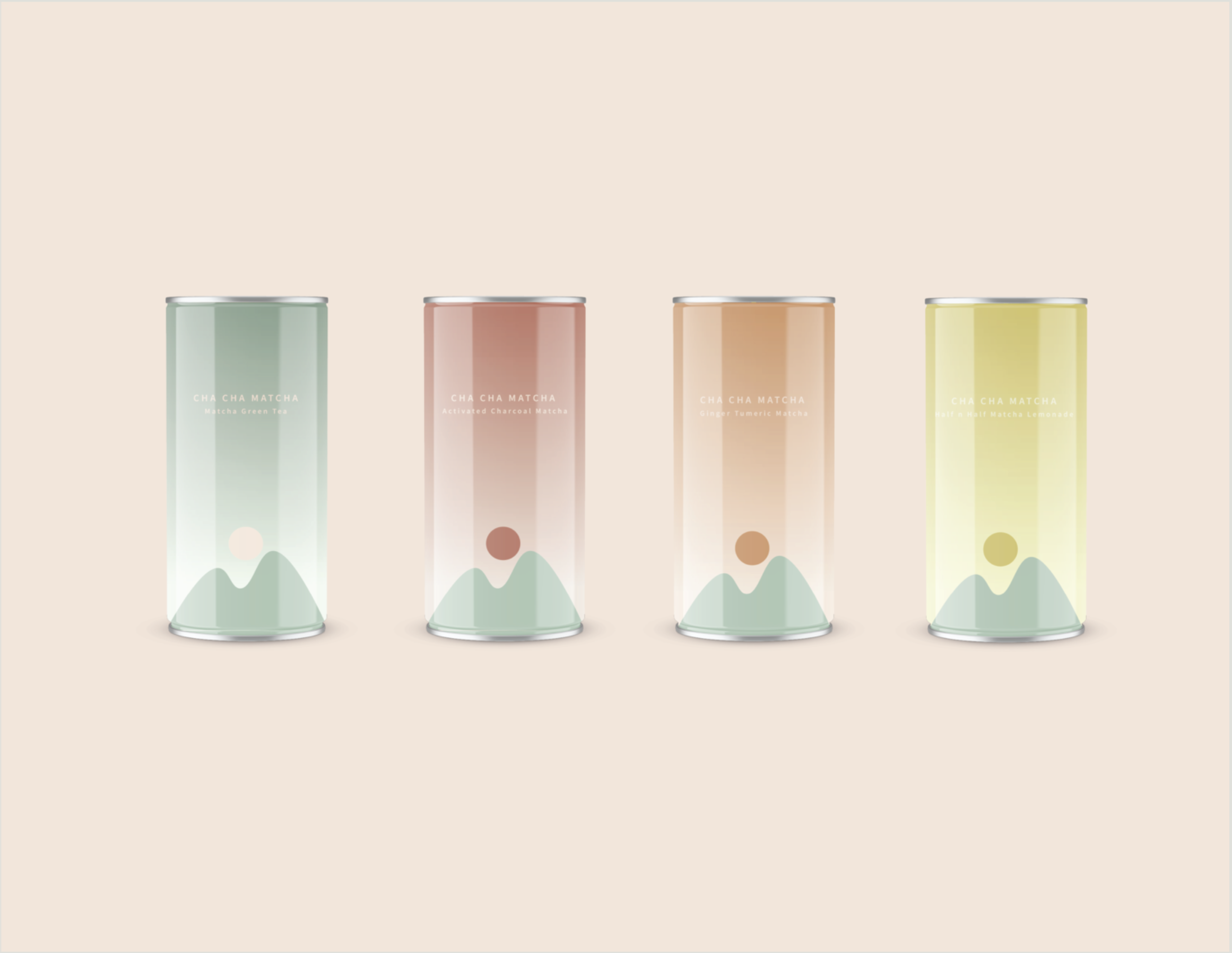
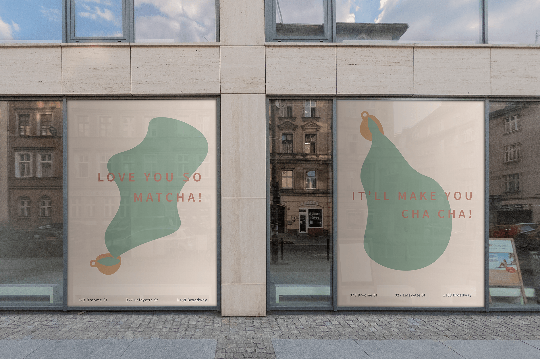
Clean the design up with earth tone colors which also relate to the culture and origins of matcha. Organic shapes are brought in to show softness and movement. The logo is the representation of the C and the M, which leads to the idea of a rising sun(C) from the mountains(M) which not only brings an energetic vibe and also is a reference to the origin of matcha. The design of the cups is zoomed-in lines of the m from the logo, which also shows the fluidness of the drinks. From the mountain M shape, it also can evolve into blob shapes, which are presented as spilled out drinks in the poster.


